Firstly they introduce the distribution and production company (their sixth form). This looks unprofessional, as it appears to be a form they were meant to fill out, but they've tried to use it to create a professional look. They should have just used the logo. They also have a countdown.
The placement of the numbers looks awkward, and overly crowded, I feel that this causes the thriller to look less professional before it has even started, They use the correct bleeps but do not add a bleep at number 2. I think that they were aiming for this type of effect.

 Next we see 'Bruna' a famous actress, we hear the paparazzi, calling her name and the snap sound whilst taking photos of her and she walks down the street.
 They've used two of the same clip to create this effect. One over the other, with a Chromo-key or 'Green screen' effect on the pink jacket Bruna wears on the top track and then a black and white effect on the same track. However they haven't done it very well, As the red from the photographers hoodie is still showing
Bruna is in a town street, or somewhere quite busy. The Camera angle for this looks like it was done in one mid shot to stay continuous, since anyone could have chosen to walk past them. The shot is a little unrealistic, as the photographer is taking pictures of her with their phone.
Next we see a caucasian man watching Bruna's paparazzi moment through his TV. A wideshot is shown, we can tell that this man is a slob, he is drinking alcohol in one hand with clutter all over the room. The room is bland which suggests that he is poor. Also, at this moment music starts to play, it is of a heavy guitar instrumental, with some percussion, We then go back to the Midshot of Bruna, just to clafiry that he is watching her.
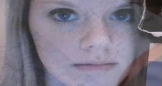
The camera goes back to the wide shot of the man, and then to a close up of the TV, where he puts down his beer, we zoom to the right and pan out slightly. We see him touch Bruna's hair, she shakes her head. She's tied up on a chair, with her hair up, and behind her is a collage of photos, all hers. Her white top has blood and dirt stains, her make up is also smudged down her face, and she has a black rope in her mouth.
I thought that the opening was strong up till this point, afterwards it begins to slack. They use the same song through out the thriller opening, and use the cut outs on the wall to show the credits which is quite creative.

 They only show Bruna's hands tied up once in a close up, and then go to a picture of the rope. It looks unprofessional to see the rope like this, especially since they have tried to place a sheet of paper behind it. They also show sinks, and other objects with blood dripping through them, they've also shown what we can assume to be the male character cutting up news papers, and creating letters with them.
 They've tried to show Bruna from a few different camera shots and angles, theres a long shot and a medium close up shot, which pans upwards.
 The thriller doesn't have many effects after this, they use a few black fade outs, and dissolves. We don't see many other objects through the rest of the opening except a book, with scribbled notes on it. The opening ends with the audio and visual fading out to black.
Our thriller might take inspiration with this, by using dark eye make up, like theirs. However I think we should be more consistent than their thriller. They should have shown her pink jacket on the floor, or underneath the chair, since it made no relevance to highlight it in the first shot, and then never seen the pink jacket again.


No comments:
Post a Comment